Oct 16, 2024
When Whitespace Became the Hero
“Design is thinking made visual — with clarity, purpose, and emotion.”
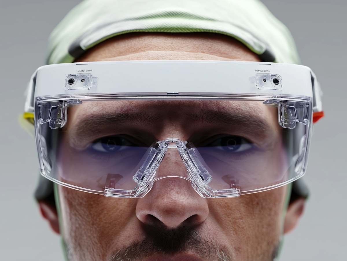
In today’s fast-evolving digital landscape, design studios play a critical role in shaping the way brands connect with people. Whether it’s building a website, crafting a brand identity, or creating stunning motion visuals, a good design studio goes beyond just making things look pretty — it solves problems, tells stories, and drives engagement. Great design is about intention, and design studios bring that intention to life with precision and purpose.
At the heart of every design studio is a deep commitment to collaboration. These creative spaces thrive on teamwork — not just within their own walls, but with the clients they serve. The most impactful work happens when ideas are shared openly, feedback is embraced, and every project becomes a shared journey. From moodboards and prototypes to final rollouts, a good studio brings clarity to chaos and keeps everyone aligned with the big picture.
What sets a design studio apart is its ability to blend strategy and emotion. Every visual choice — from typography to layout to color — is rooted in thoughtful design principles. It’s not about chasing trends, but about creating work that lasts. Studios often function as a bridge between art and function, giving businesses a unique voice while maintaining usability and consistency across all touchpoints.
Ultimately, design studios are more than service providers — they’re creative partners. In a world where attention is fleeting and competition is fierce, a studio helps brands stand out and stay memorable. The best ones don’t just deliver visuals; they leave an impression, spark conversations, and make people feel something. That’s the true power of design.
Explore more


Let's get in touch


GOLDEN HOUR
— Olivia Harper, Creative Director